The way you design and develop your website, can cause your website visitors fall in love with it, or swear never ever to visit your website again.
Some of the these mistakes, we make them unknowingly and there are those we make knowingly because they seem appealing to our eyes as website designers, yet website visitors will consider them an insult.
So, here I list for you 9 deadly mistakes you are making with your website. The mistakes you should avoid to make your website a better place for you and your visitors.
#1. Not Mobile Optimized

Google values mobile optimized websites to to those that are not. Ok, maybe you don’t care about Google, but research has it that, in 2014 Mobile Internet usage had already exceeded desktop.
If mobile browsers don’t understand your website, and some elements appear to overlap others, then regardless of how important the information is that you are giving your visitors, they will hit the back button within seconds.
Its important you consider optimizing your website for mobile devices, and doing this will see your website statistics improve greatly.
#2. “Under Construction“

Websites are living documents, they are supposed to be alive and breathing on the web. Why publish it if it isn’t ready to go online just yet?
Do not publish your or your client’s website, just to caption it with the “Under Construction” statement. This will just make you look like an amateur to people visiting your website.
A website is not a physical building, where you have to tell and warn passersby of its construction. Before we know, you will be displaying “Men at Work“.
#3. No Privacy Policy Page
Again, Google loves websites that have a privacy page. Just because, you don’t collect your visitor’s data doesn’t mean you shouldn’t have a privacy policy.
If you do collect data from your visitors, you should tell them. Similarly, if you don’t you should tell them explicitly that you don’t.
So, either way, you still need a a privacy policy page on your website for your website. Assuming your visitors won’t care is a huge mistake.
Here is a Privacy Page generator you can edit and add to your website.
#4. “Welcome To Our Website”
This is another mistake I’ve seen on some websites. I know sometimes you want to sound and look so kind to your visitors, to the extent that you wanna shake hands with them.
Get straight to the point, your website visitors are already welcome if they weren’t, they wouldn’t even be seeing this welcome page.
Show your visitor how you can help them, and they will stick around if it is the kind of help they are looking for.
#5. Long Paragraphs
Its true that, people don’t like to read word by word on the web. Unless you are a real reader, but I know chances are that, you are skimming this article too.
Long paragraphs will discourage your visitors, its better to break it down and give your website visitor’s eyes some break.
Keep it short and precise to the point. And emphasize on important points, either by bolding or highting on them. This will work for skim readers.
#6. Visitor Counter
This is another interesting one, who tells you that your visitors visited your website to see how many people are visiting it? This is a blunder.
Your website statistics benefit you as a website owner. Showing your visitors tens of thousands of visitors visiting your website will just make them question the credibility of those figures.
They will think you are faking the figures just to keep them around. Concentrate on what your visitors require and if they like it, they’ll stay, if its not for them, they leave.
Use Google Analytics to monitor your website visits at the background, without letting your visitors to know. Because this data benefits you, not your visitor.
#7. No Or Outdated Copyright Statement
Have you visited a website lately, and at the footer all you see “Copyright 2005”? How does that make you feel? This turns me off, I begin to wonder if the information on such a website is still relevant.
You should copyright your website content, page by page. Its better to use the year to auto-update. If you use PHP, date(‘Y’) would make your copyright statement current every year.
#8. Dead/Broken Links
Dead or broken links can turn your website visitors off, it makes them think you don’t update your website and you just dumb stuff there.
When visitors click links that take them to a 404 page, this can be such a big disappointment to them since they were hoping for something by the time they clicked that broken link.
Ensure all your website links are fresh and working. If they’re broken, update them right away or take them away if the resource exists no more.
See how to find and fix broken links on your website, or you can use W3C link checker to check for broken links on your website. Its free.
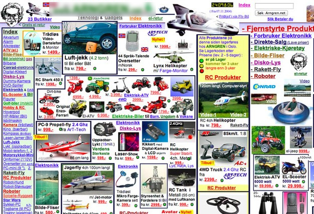
#9. Too Much of Anything Is Really Bad


